TIPS & TRICKS
Color Mistake #4: ACCENT COLORS

Accent Colors can be a great way to help create texture or make certain areas of your home stand out. But what happens when those two colors that looked so different on paint swatches, end up looking identical once on your walls?
In this weeks' video I'll show exactly why this may happen and what to do to avoid it.
Are Your Colors Holding You Back?

This is in my opinion the most POWERFUL video I've recorded so far. Please watch at your own risk ;)
What's YOUR Favorite Color?

This is one of the first question I ask my clients during a Color Consultation. I love observing their reactions as they first attempt to answer this question. In most cases they tend to answer in terms of their favorite color to put on walls (which makes sense of course).
But my intention in asking them this question goes a lot deeper... much much deeper...
The PRICE of Color

This is an extreme example but it does illustrate how much Color can impact the price of a project.
Years ago, we painted the Offices for a Local Radio Station here in Moncton, NB. After the Color Consultation was completed by the Interior Decorator, the price tripled... yes you read that correctly - TRIPLED!
Watch this weeks New Video to learn more. :)
What does MUSIC & COLOR have in common?

One of the things I often hear clients say to me during a Color Consultation is this... "I want lighter colors!"
But what's interesting is that in a lot of cases, that's completely wrong. What they want instead is a different song...
How to Leverage the Power of Color? ... 2 things to consider

Color has a big influence on your everyday life... one way or another.
Here are the 2 things to consider if you want to leverage those colors for your benefit.
What Colors Are In?

What Colors Are In?
What Colors Are Out?
Check out this video to find out!
The Cost of COLOR
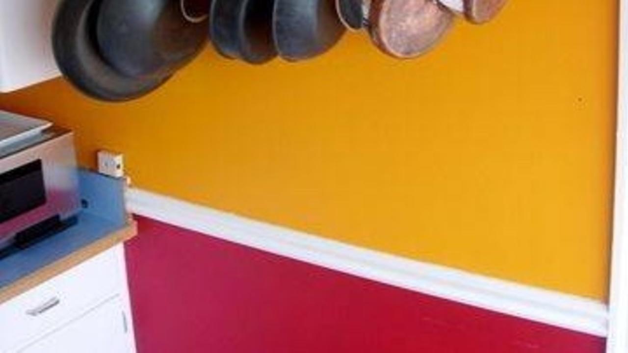
When choosing colors, it’s important to keep in mind that the cost of getting the space painted might be affected by the color choices…. And in some cases, the difference can be drastic (see below) :)
FIRST: The total number of colors.
If you decide to have a high number of colors for your project, this means the painting contractor will have to purchase a lot more paint. Extra colors will also result into more materials and more labor with all the different brushes and rollers to setup and wash.
SECOND: How dark or light the colors are.
If you decide to go with bright colors or colors that are opposite of what’s currently on the walls in terms of how light or dark the colors are, this will most likely result in a higher number of coats. Certain colors, like the ones in the image to the right, will require a grey primer to achieve the specific color. Other colors will require a white primer. Some will simply need you to apply a third coat to cover properly....
The Main Color: 3 reasons to have one in your home

During a color consultation, I usually recommend having one main color go through the majority of the house in rooms such as entrances, hallways, stairways and maybe even spare rooms (or rooms who’s function may change from time to time). This main color, which I refer to as “The Grounding Color”, is typically a grayish beige/brown color and serves a few different functions.
FIRST: Because most rooms are attached to an area where the main color is (such as hallways), it makes it very easy to coordinate various colors since this main color is usually neutral. This is great if you have specific requirements for a room but still want everything to flow well together.
SECOND: Having a neutral main color also makes it easier for the “important” rooms to stand out and help attract people to them. Essentially, entrances, hallways and stairways are only a means to an end… meaning people will have to go through them to access the kitchen, the living room,...
Shiny Colors

When choosing colors, it’s important to recognize that the shine of the paint plays a major role in how each color will react.
For example, even if you were to choose the exact same color and paint an entire room with the following levels of shine (Flat for the ceiling. Eggshell for the walls. Semi Gloss for the trims and doors.) you would notice that each surface would look a little different from the other.
Shine intensifies each color and make it pop up. That’s why photos are usually printed on glossy paper.
The wall on the image illustrates this concept quite well. This wall was painted with the exact same color but with stripes in a glossy finish.

