TIPS & TRICKS
[3 STEPS] How To Pick The RIGHT COLOR

Choosing the right paint color for your home can feel overwhelming. Many homeowners in Moncton, Riverview, and Dieppe run into the same problem—you pick a color expecting one result, only to see something completely different once it’s on the wall.
That “perfect gray” suddenly looks blue, green, or even purple.
Hi, I’m Remi Boudreau, Licensed Painter, Color Consultant, and owner of Expressions Painting. In this guide, I’m going to walk you through the exact 3-step process we use with our clients to make sure their vision becomes reality.
Step 1: Start with a Fan Deck to Compare Undertones
The first step in choosing the right paint color is using a fan deck.
A fan deck allows you to see multiple shades of a color side by side. This is incredibly important because undertones are almost impossible to detect when looking at a single swatch.
For example:
- -Some grays have green undertones
- Others lean purple or blue
- Some shift toward beige (greige)
When you compare them togethe...
Here’s How We Paint Doors | Greater Moncton Painting Contractor
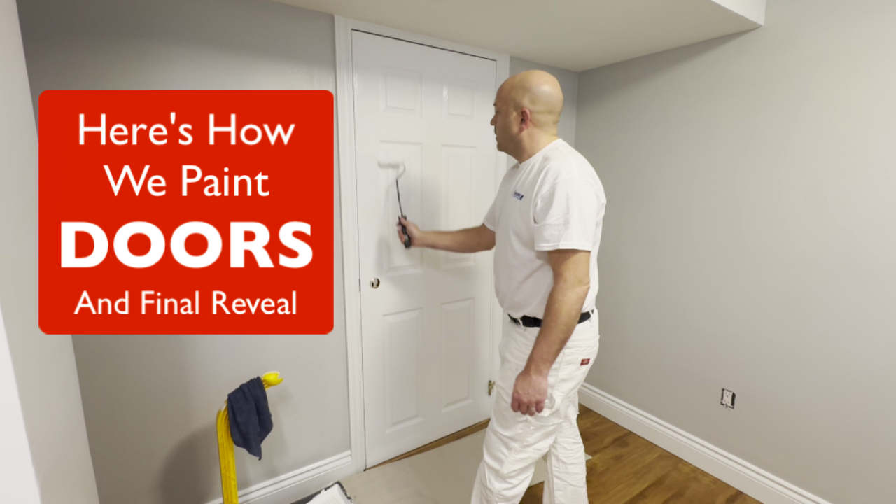
In this video (see below), I’m going to show you exactly how we paint interior doors—and more importantly, the mechanics behind getting a smooth, even finish.
My name is Remi Boudreau, licensed painter, color consultant, and owner of Expressions Painting, proudly serving homeowners across Moncton, Riverview, Dieppe, and the Greater Moncton area.
Why We Paint Doors Last
In most of our projects, doors are one of the final steps.
The reason is simple: we want to get your home back to normal as quickly as possible so we prioritize painting the areas where furniture had to be moved.
Step 1: Remove Hardware & Prep
We start by removing the hardware that could get in the way—typically the door handle and latch (door catch)—while leaving the hinges in place.
This allows us to work efficiently without disturbing the door alignment, while still achieving a clean, professional finish.
Step 2: Cut In the Areas Rollers Can’t Reach
Just like with walls, the first step is cutting in.
On d...
Here's How We Sand, Cut & Roll the Final Coat (Moncton Painting Tips)
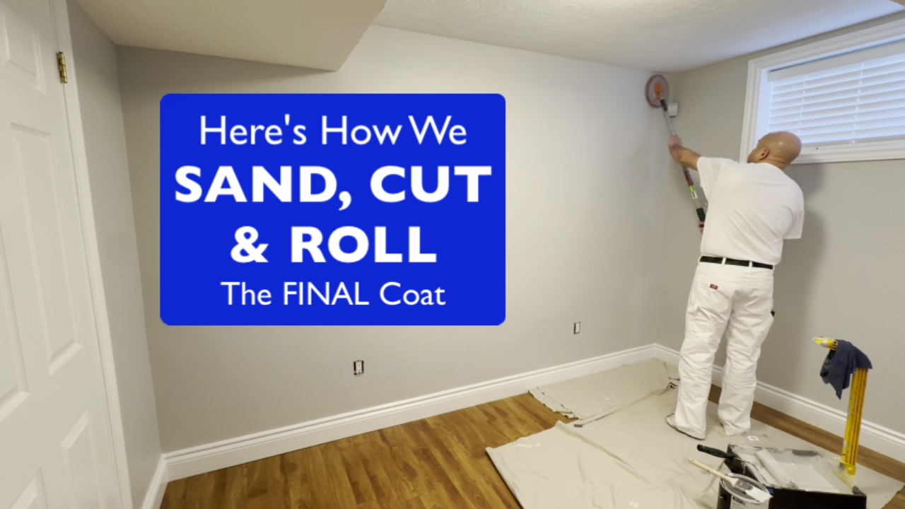
If you’ve ever painted a room yourself, you already know—getting that final coat to look smooth and professional is where things can go wrong fast. From dried paint chunks to uneven cut lines, it’s often the small details that make the biggest difference.
In this post, I’m going to walk you through how we pole sand, cut in, and roll final coats, along with a few key techniques we use on projects throughout Moncton, Riverview, and Dieppe to consistently deliver a clean, high-end finish.
By the time we get to the final coat, the goal isn’t just coverage—it’s refinement.
At this stage, we’re checking for subtle imperfections, correcting visual inconsistencies, and ensuring lines are sharp and consistent.
In repaint projects especially, surfaces aren’t always perfect. Years of previous work mean we need to adjust visually, not just technically. That’s where understanding the mechanics really matters.
Step 1: Pole Sanding for a Smooth Base
Before any final coat goes on, we quickly pole sand...
Here's How We Cut Straight Lines Without Tape (Moncton Painting Tips)
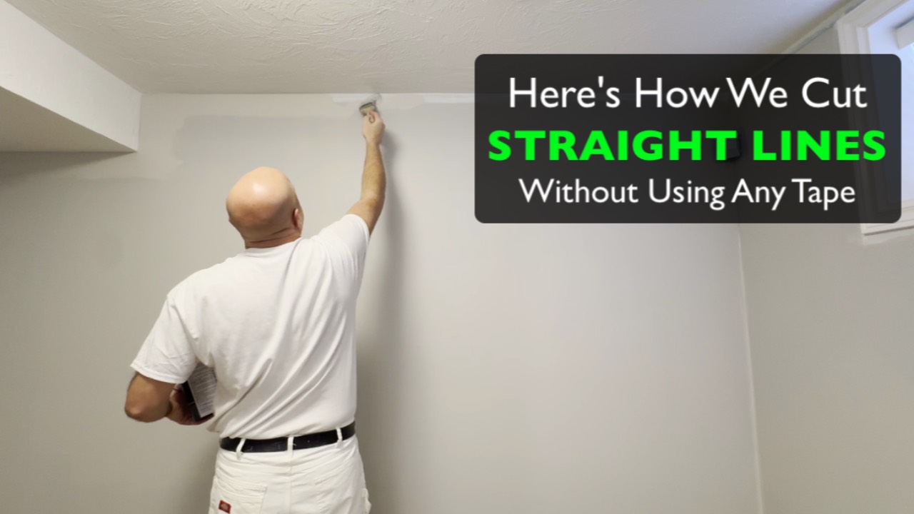
If you’ve ever watched a professional painter work, you might have wondered something:
How do they paint perfectly straight lines without using tape?
In this article, I’m going to walk you through exactly how we do it and explain the mechanics behind cutting clean lines with a brush. Whether you’re a homeowner in the Greater Moncton area curious about how professionals work, or a painter looking to improve your skills, this will give you a better understanding of what’s really happening behind the brush.
My name is Remi Boudreau, Licensed Painter, Color Consultant and owner of Expressions Painting. We proudly serve homeowners throughout Moncton, Riverview, Dieppe, and surrounding communities in Greater Moncton.
The Brush We Use
One of the first questions people ask is what type of brush we use.
The brushes we primarily work with are from a Canadian brand called Zachary Brushes, specifically the Royal 2½‑inch sash brush.
Now, I want to make something very clear:
The brush does ...
Here's How We Roll Walls in Greater Moncton
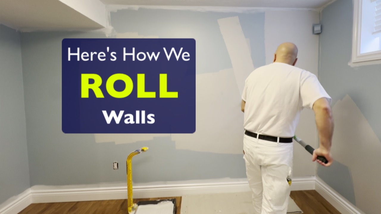
If you’ve ever tried rolling walls yourself, you know it’s not as simple as dipping a roller in paint and going up and down. Uneven coverage, lap marks, inconsistent sheen, and color surprises are common frustrations.
In this article, I’m going to show you exactly how we roll walls at Expressions Painting — the same process we use in homes throughout Moncton, Riverview, and Dieppe.
My name is Remi Boudreau, Licensed Painter, Color Consultant, and owner of Expressions Painting. Since 1997, we’ve been refining our systems to deliver smooth, consistent, professional finishes.
Whether you’re a DIY homeowner in Greater Moncton or researching before hiring a painting contractor, this guide will help you understand what separates a professional result from an average one.
VIDEO VERSION AT THE BOTTOM OF THE PAGE
The Wall Paint We Use (And Why It Matters)
Our preferred product is Sherwin-Williams Opulence (known as Cashmere in the United States).
We typically use the Low Sheen Eggshell f...
Here's How We Paint Baseboards & Frames in Greater Moncton Homes

When homeowners invest in professional interior painting, the difference often shows up most in the details — especially on baseboards, door frames, and trim.
At Expressions Painting, we follow a very specific system when painting trim in homes in Moncton, Riverview, and Dieppe. The goal isn’t just clean coverage — it’s long-term durability and a refined, smooth finish that holds up to daily life.
Why Trim Paint Quality Matters in High-Traffic Homes
Baseboards take more abuse than almost any other painted surface in a home.
They’re regularly hit by:
- Vacuum heads
- Shoes and boots
- Cleaning products
- Pets and everyday traffic
Because of this, we don’t treat trim like wall paint. It requires a different product and a different application method to ensure it looks great not just immediately after completion — but years later.
The Trim Product We Trust for Long-Term Performance
For the past several years, we’ve relied on Emerald Urethane Trim Enamel by Sherwin-William...
Here's How We Paint Ceilings | Tips from a Greater Moncton Licensed Painter
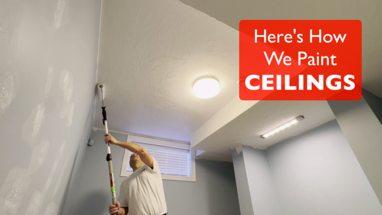
If you’ve ever tried painting a ceiling yourself, you already know—it’s a completely different challenge than painting walls. Between working overhead, managing roller marks, and keeping a consistent finish, ceilings can quickly become one of the most frustrating parts of a painting project.
My name is Remi Boudreau, licensed painter and color consultant, owner of Expressions Painting, proudly serving homeowners throughout Moncton, Riverview, and Dieppe. In this guide, you’ll learn seven tips to make ceiling painting faster and easier. There's also a video version below with more information and demonstrations.
Tip 1: Spot Prime Repairs
Always spot prime ceiling repairs before the final coat. This prevents uneven absorption and patchy areas.
Tip 2: Use the Right Roller Nap
We recommend a 15 mm nap for homeowners and an 18 mm woven nap for professionals. A thicker nap holds more paint and reduces roller marks.
Tip 3: Keep the Roller Properly Loaded
Avoid stretching the paint too...
How to Achieve Flawless Drywall Repairs Without Sanding: Tips from a Moncton Painter
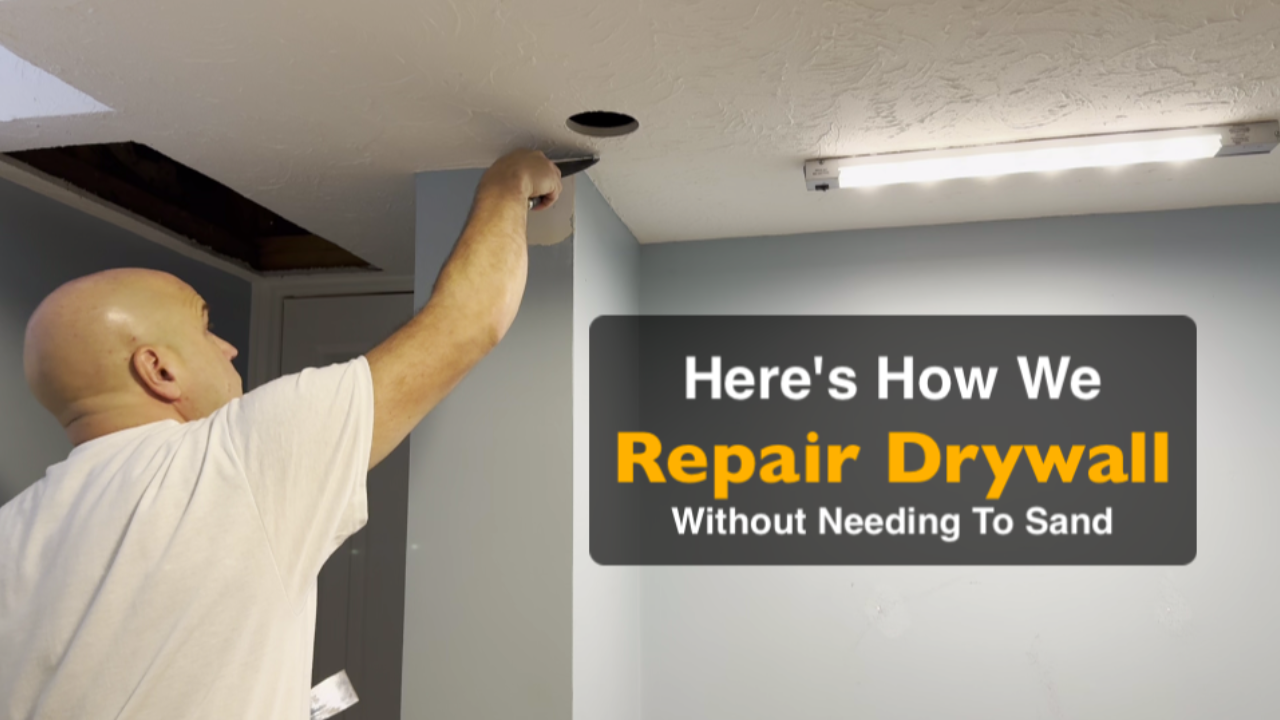
If you’ve ever tried to fix holes or imperfections in your walls, you know how messy and time-consuming drywall repair can be. At Expressions Painting, a professional painting company in Moncton, NB, we’ve developed a method that delivers flawless results without the need for sanding, saving time and keeping your home clean.
In this blog post, I’ll walk you through the exact steps we use for drywall repair, sharing tips that both homeowners and professional painters can apply.
Step 1: Prepping the Repairs
Before applying any compound, we go through the room and prep the repairs. This involves:
- Checking for loose drywall or protruding nails
- Pushing drywall paper into the holes
- Ensuring the wall surface is flush with a utility knife or 5-in-1 tool
Prepping first allows us to focus on filling the holes in a second pass. It’s more efficient, reduces tool switching, and ensures a smooth final finish.
Step 2: Choosing the Right Compound
One of the secrets to a flawless finish is the...
Here’s How We Paint a Room or an Entire House (and Avoid a Costly Paint Color Illusion)
When it comes to interior painting in the Greater Moncton area, there’s more than one way to get the job done.
At Expressions Painting, we’ve developed a process that ensures high-quality finishes, minimal disruption, and true-to-color results for homeowners in Moncton, Dieppe, and Riverview and surrounding area.
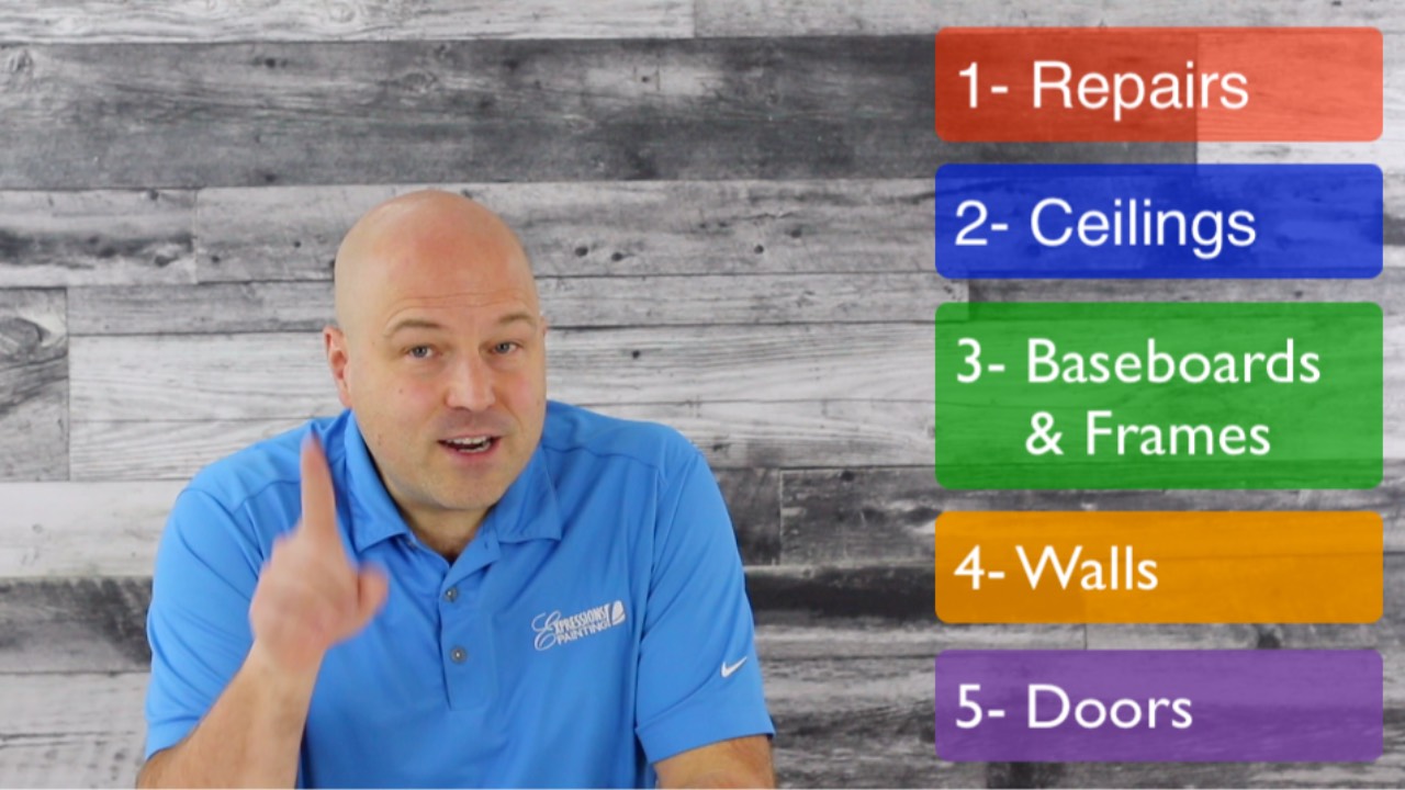
I’m Remi Boudreau, a licensed painter and color consultant. In this post, I’ll walk you through the 5 steps we follow on almost every project, explain a common—and costly—color illusion, and show why our method helps homeowners fully leverage the transformative power of color in their space.
Step 1: Repairs
Before any paint touches the walls, we start with repairs. This includes drywall patching, filling nail holes, and caulking. While it may seem obvious to start here, by doing repairs first, we also contain the mess before laying down drop sheets, making the process cleaner and more efficient.
Step 2: Ceilings
Next, we tackle the ceilings. Many DIY painters make the mi...
There Is No One “Right Way” to Paint

After more than 26 years in the painting industry, one thing is clear: there is no single correct way to do the job.
Every painting project is influenced by location, materials, budget, and client expectations. That’s why professional painters often work differently — and still deliver excellent results for their clients.
Over the years, we’ve developed our own proven systems through real-world experience, testing, and continuous improvement. These methods help us deliver high-quality results while staying efficient and customer-focused.
In a recent video (see below), I explain the problem I noticed with how to videos and what I've decided to do about it.
To read the full article visit:
https://www.expressionspaintinguniversity.com/blog/here-s-the-problem-i-noticed-with-how-to-videos
If you’re in Moncton, New Brunswick and looking for professional interior painting services, we’d be happy to help.
Contact us today to discuss your next project.

